Facebook Connect – Empowering Lightweight and Scalable Development For All

In a day and age of software accessed via web browsers, the fundamental development and design models of the desktop age are being turned on their heads. Heavyweight design, development, release and maintenance software processes have been replaced with lightweight, agile and flexible methods of supplying software and services that meet new customer expectations. In O’Reilly’s definition of Web 2.0, lightweight programming is about syndication of data and service and also the remixability and extensibility of functions and services to the benefit of the user and the provider.

One product which follows O’Reilly’s guides and which can assist companies during their start-up phase (where cheap is always best) is Facebook Connect. Facebook Connect is Facebook’s authentication and user information management platform which the company provides as a convenience to sites and services which need a login and user information management system.

The Connect with Facebook button allows users to login to third-party sites with their Facebook account.

Facebook Connect functionality is provided through an Application Programming Interface (API) which Facebook manages and maintains. This reduces overheads for the companies using the Connect service as another party is managing the technical aspects of interfacing with Facebook’s internal data stores and functionality and making necessary updates, while the user simply implements Connect and things just work. The benefits provided to organisations implementing Connect expand when the service is used as a login system for these organizations. Their costs of managing secure login services and user data management plummet, and Facebook benefits from extended reuse of their data.

As Facebook is a massive web service, the company already addresses one of the core requirements of the lightweight development/doing more with less design pattern by leveraging their existing cloud infrastructure. As Facebook manages all data centre work and all data management activities, organizations implementing the Connect service do not have to worry about managing any of these commoditised activities. Facebook can easily manage peaks in requests if something on Facebook Platform goes viral.

One final thing Facebook does well with Connect is the syndication of their business model through Connect. Facebook builds it’s business on advertising, which depends on data, specifically data created and maintained by individual users. By offering Connect, Facebook essentially expands their data collection reach outside of the immediate organisation and onto any site that uses the Connect service (especially through the Like button). By collecting more data, Facebook has more data to leverage to their strategic advantage in serving ads effectively.

The only issue Facebook has with respect to doing more with less is monetisation of the Connect service. The service itself does not produce any direct income for Facebook, which solely relies on the extra data gained through Connect implementations to deliver more targeted ads within Facebook. If Facebook wished to expand their ad network as part of Connect, managing advertising on external sites and services would be a massive overhead just for the Connect service and would likely require a separate part of the Facebook Platform to be developed.

Overall, Facebook Connect is an interesting example of a scalable, lightweight web 2.0 technology that has a lot of potential for both Facebook and the users of Connect. It will be interesting to see how services like Connect (especially Google’s +1 and Buzz services) change and compete in is area in the future.
iStockphoto – Reaching Niche Markets with Web 2.0

The web is a powerful tool to reach people with products and services. With Australians spending an estimated $12 billion online in 2010, reaching consumers through the web is quite lucrative; and with this we are ignoring the fact that the web is a worldwide phenomenon. The web empowers sellers to reach a global market of consumers with lower overheads than traditional stores.

O’Reilly realised the impact of the web on sales to the consumer. Due to plummeting cost of production and distribution, the Internet is actually a large collection of small sites and groups (niches), not a small number of big consumer groups. This is where O’Reilly suggests leveraging the long tail – reaching smaller markets on “the edge”, rather than targeting the major markets like everyone else does. Leveraging the long tail requires excellence in customer self-service and harnessing collective intelligence to deliver the best value to customers.

One online service that leverages the long tail to it’s financial benefit is iStockphoto. iStockphoto sells royalty free photos, illustrations, audio, video and Flash animations. The site started in 2000, selling just a few photos. This is where the site leverages one of the very fundamental parts of the long tail design patter – make your niche in the long tail fatter. By developing the service from a few photos to a diverse range of multi-media covering audio and visual aspects, iStockphoto has grown their market and made it more attractive for them to target. By doing this, they also increased the value for their customers, giving them reason to stay with the service.

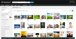
iStockphoto Screenshot
iStockphoto showcasing the editors' picks.

Beyond this, anyone can contribute content, democratising the contribution process. People already have their own tools and knowledge and can produce content they can offer to iStockphoto and earn commission off. iStockphoto can also balance supply and demand, as they perform a manual review process. They know what consumers want and can control what is and is not made available. Content is also generated on top of the digital content through keywords (users essentially provide free tagging for their images, making search easier). Unfortunately, iStockphoto does not use other metadata such as popularity or ratings to suggest further purchases to users, so they are missing out on possible value here.

To successfully use the long tail to financial benefit, customer self-service becomes important. This is one area where iStockphoto has made a trade off between control and fully implementing the design pattern. While most of the support services are outsourced to the client through forums, FAQs and manuals, iStockphoto insists on vetting all of the content that actually is put up for sale on the service. This creates significant overhead in terms of staffing to perform the manual approval process. To reduce the actually overheads here, iStockphoto could consider outsourcing this to the users. This could be an effective move, as manuals for quality are already made available to contributors for their own self-check of work before submission. By using multiple users to check and vet the content, iStockphoto gets free labour. Users would also feel more intimately involved because their contributions are visible on the service. It’s a win-win for iStockphoto and their users.

Overall, iStockphoto democratized content sales and reaches niche markets well, but there is a lot of the pattern the service could integrate to improve their service.

What else could iStockphoto do to build their use of the long tail?

Toodledo – Perpetual Beta

When Tim O’Reilly wrote his famed article “What is Web 2.0?” in 2005, it is likely he could see where applications have evolved to today. His vision was the end of the software release cycle; a form of online software development and distribution where the user had seamless access to a service managed by a provider. O’Reilly posited that to be successful, software and service providers must follow some basic rules when it comes to using the End of the Software Release Cycle pattern. Primarily, these rules are: operation must be a core competency (a company must excel at what it does or what its product does), make use of “instrumentisation” (make software capable to returning implicit user testing results to developers for relentless improvement), involving users as co-developers (tapping into customer needs, wants and suggestions), release often and using lightweight tools.

Web 2.0 is full of examples of services leveraging this pattern. Google is a major proponent of this ethos; Gmail bore the Beta name-tag for the first five years of its life, which was finally dropped in 2009, but not after Google made statements which back up those sentiments expressed by O’Reilly. There is clear advantage to responding to customer needs by reducing the barriers to meeting said customer needs.

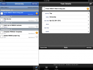
Toodledo is a nice example of how web developers and web service companies may derive value from the End of the Software Release Cycle Web 2.0 pattern. The tool is a cross-platform, web-based tool for to-do list and task management. The tool has been around since 2006 (according to the Toodledo website) and has been expanding across platforms up to this day.

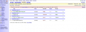
Toodledo Main Web Version (Folder View)

The providers of Toodledo make use of several of the aspects described in O’Reilly’s work on the relevant design pattern. First and foremost, updates to the software and service are consistent and frequent. Toodledo’s own Blog is a testament to their continuos release of bug fixes and new features. This is important, as it allows them to take feedback directly from user requests, which is another part of the pattern. Toodledo’s release notes are testament to their responses to their user community. This is important, as feature additions keep users coming back on a repeat basis. Toodledo also manages to balance these changes by spreading changes over time. This means users have time to adjust to features and are not greeted by a new interface each time the use the service.

The company also uses lightweight mechanisms to create their software. The API offered by Toodledo allows connection via eXtensible Markup Language (XML) and JavaScript Object Notation (JSON), both of which are publicly accessible and lightweight languages for data communication. Developers from the Toodledo community are empowered to create plug-ins to the service due to the use of these open frameworks (empowered by Toodledo’s use of the Data is the Next Intel Inside Web 2.0 design pattern). External developers and users may be connected with internal developers using Toodledo’s forum community, further enhancing the use of the design pattern at hand.

While Toodledo makes good use of the pattern, there is room for the service to improve. While the web service is lightweight, making use of light frameworks and open-sourced tools and languages, the iOS application is written in Objective-C, a  language attributed to Apple and required for iPhone development. While there is no way to avoid this in terms of distributing the iOS application through Apple, there is a market for releasing the app using the same frameworks and languages used in the full web version. Toodledo’s Slim version goes some of the way. It would also be possible for Toodledo to make use of shadowed software and implicit user testing/instrumentation to improve their development by collecting usage data. This requires some overhead and it may be possible Toodledo already does this without telling the community clearly.

Toodledo iOS (iPad) Version

Toodledo is an interesting example of the End of the Software Release Cycle. Heavy reliance on the community for ideas and feedback, frequent updates and seamless updates exploit the design pattern well. While there is room for improvement, Toodledo is an innovative company that is embracing the design pattern well over time and running with the ideas that are generate from this pattern.

Toodledo is a powerful cross-platform tool powered by the End of the Software Release Cycle. How else could Toodledo exploit this pattern to derive competitive advantage?

References

  • Apple. (2011). iOS Application Programming Guide. Retrieved April 22, 2011 from http://developer.apple.com/library/ios/#documentation/
    iPhone/Conceptual/iPhoneOSProgrammingGuide/Introduction/Introduction.html
  • Coleman, K. (2002). Gmail leaves beta, launches “Back to Beta” Labs feature. Retrieved April 22, 2011 from http://gmailblog.blogspot.com/2009/07/gmail-leaves-beta-launches-back-to-beta.html
  • O’Reilly, T. (2005). What is Web 2.0?. Retrieved April 22, 2011 from http://oreilly.com/web2/archive/what-is-web-20.html
  • Toodledo. (2011). Developer’s API Documentation: Tasks. Retrieved April 22, 2011 from http://api.toodledo.com/2/tasks/index.php
  • Toodledo. (2010). Toodledo Blog: News, Updates and Changes. Retrieved April 22, 2011 from http://www.toodledo.com/info/news.php

Tumblr – Software Above the Level of a Single Device

Web 2.0 is a powerful tool which is now reaching far beyond the desktop computer; the ability to reach target markets is increased dramatically. In 2010, there were five billion Internet connected devices – an incredible channel to reach users and target markets. But these 5 billion devices include traditional desktops, mobile phones, tablets and any number of other devices. Clearly, one version of an application cannot suit all devices due to the variances in the features of devices.

This is where the concept of software above the level of a single device arises. As one of the core Web 2.0 design patterns, this pattern states that web applications should be tailored to meet the needs of individual devices, by targeting specific features of a service to devices, and making the most of what these devices have to offer. This creates a rich, tailored and complete service which a company can and should use as part of their Web 2.0 offering.

Focusing specifically on mobile devices and the desktop, there are a collection of web apps that have complimentary mobile app options. One such company offering this functionality is Tumblr. Tumblr is a unique blogging platform, siting somewhere between micro-blogging service Twitter and full-blown WordPress, Blogger and other blog services. It encourages users to post short content – quotes, text, links, photos and so on – but deliver this in a more blog-oriented style. While Tumblr is multi-platform – there is a desktop tailored web-app, native applications for iPhone, BlackBerry and Android, and also connectivity to Twitter and Facebook.

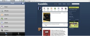
Tumblr makes unique use of software above the level of a single device best practice. First, Tumblr tailors the experience of posting to the device. On the desktop, the web app fills the display and has a wide-screen layout. On the mobile devices, the posting activities are tailored to fit the display. Tumblr takes these steps to suit the device and ensure accessibility, which invites content contribution by users. Further, mobile device applications take use of the hardware on these devices (specifically photo, video and audio recording), which are not always available on desktops. Users always have their mobile devices with them, meaning the barrier to contribution is lowered and the user may post from where the action is. Data is available across the web and mobile platforms once the data is posted.

Tumblr for iPhone vs. Tumblr for Web
The post selection screen for Tumblr on iPhone compared to the same interface for Tumblr for Web

One aspect of the pattern which Tumblr does not integrate is location. There is a push for location services in web 2.0, examples including FourSquare, Google Places and Facebook Places. Tumblr is positioned to include functionality to post a users location and have a Google Map show as the post on the user’s Tumblr blog. It may also be possible for Tumblr to spread social interaction to the real world and allow a way for users to discover posts near them, as a way to find out interesting things going on around them. This in itself would require Tumblr to further adopt Web 2.0 strategies such as harnessing collective intelligence as in other blogging applications, perhaps through comments.

Overall, Tumblr is a very focused application which addresses the more important best practice of the software above the level of a single device design pattern, but has room to grow and take advantage of other parts of the pattern.

Tumblr has given me a new way to reach my audience. How have/can you use Tumblr in your social media brand?

Prezi – Rich User Experiences

Web 2.0 signals a major change in the software market – we are moving to a platform where users can create and disseminate content using powerful, desktop-replacement applications on the web. Rich User Experiences is a design pattern that Web 2.0 exploits to deliver desktop like applications, powered by JavaScript, XML, AJAX, SOAP and REST technologies. These web apps provide the same features as their desktop counterparts, but have the added advantage of being connected and available anywhere there is an Internet connection. Multiple and lengthy installations are a thing of the past, and data is liberated and can be shared with friends and colleagues.

There are a lot of examples for Web 2.0 applications which make use of engaging interaction to provide a rich experience – sites like Microsoft Photosynth, certain advanced features of YouTube like Leanback and the Queue, and tailored experiences for mobile version of apps (like Google Search with their Instant Preview on mobile). These products and systems all have specific goals and offer a tailored solution to a specific consumer need, while also making use of strategies for rich user experience.

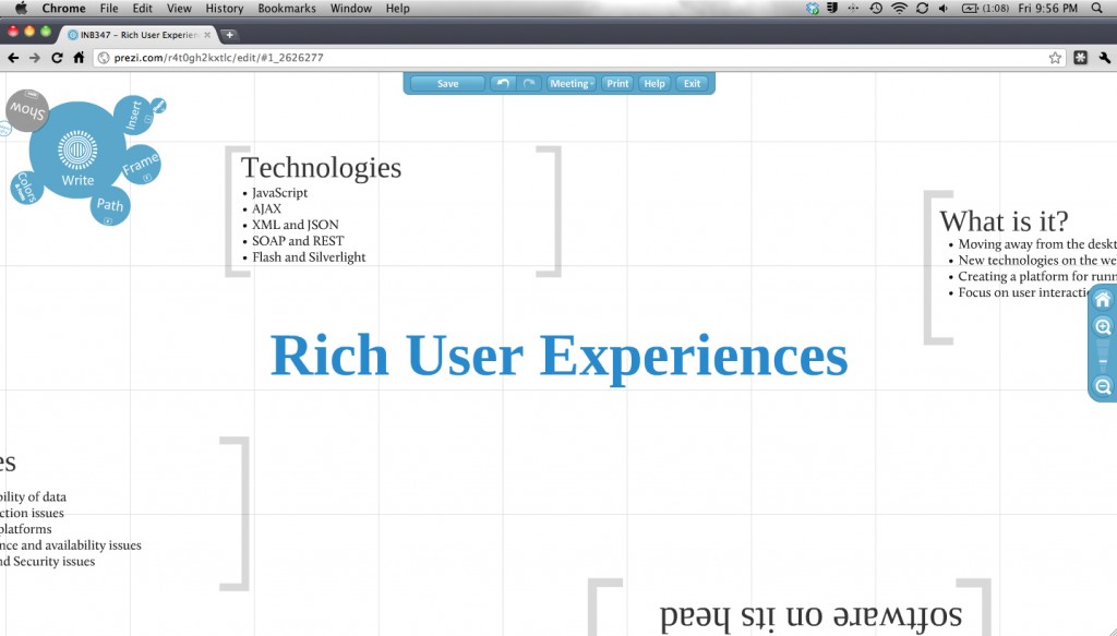
One very unique application in the domain of rich user experience online software is Prezi. Prezi is, as you may guess, a presentation program. This may make it sound like Microsoft PowerPoint, but this product is nothing like the presentation programs we are use to on the desktop. Prezi is a zooming presenter – there is no concept of pages or slides. Everything is on one large canvas that can have text, headings, images and video embedded, and then “paths” (the navigation structure) placed over top to control the presentation flow. This means there has been a lot of effort to tailor the presentation development process to match the goals of the system and also the capabilities of the web.

A screenshot of the Prezi edit interface.

Prezi is a very unique example of tailoring an existing desktop application and adapting it to suit the patterns employed by Web 2.0. The Prezi system is available across platforms – any desktop or notebook via any modern web browser and also on Apple’s iPad, and includes similar tools to a desktop presentation app – minus some more advanced features such as transitions and build-ins. This in itself seems like Prezi just hasn’t bothered implementing these features because they are unimportant or are technically impossible. On the contrary, Prezi is simply focusing the core components required to get innovative and exciting presentation software onto the web. This is an important factor, as the simplicity in designed creates a focus on a compelling workflow. This differentiation is critical to focus the use on Prezi’s core competency – engaging and highly visual presentations. This reduction and condensation of tool set also simplifies the use process – users can learn quickly. All controls are highly visual and designed to be natural to use. The only confusing part of Prezi is letting go of preconceptions of what a presentation is, and this means the user needs to consider if they can work with such a radically different presentation paradigm.

Looking at the parts that Prezi doesn’t do so well at, the main issue is deep personalisation. While tools are easy to get to, there is no “shortcut” system where the most frequent tools are made easier to access. There is no setting to automatically remember a user’s preferred security/Prezi visibility setting. These issues are easily fixed, and aren’t critical, but would add to the entire experience. Overall though, Prezi integrates the best practice for the Rick User Experience Web 2.0 pattern.

As part of my personal commitment to practicing what I preach, I created a basic Prezi about this weeks content. It is embedded below.


Prezi will give me a new way to communicate ideas with an audience. How could you use Prezi?

References

Ray, B. (2011). Google squeezesthumbnails into mobile search. Retrieved April 1, 2011 from http://www.theregister.co.uk/2011/03/10/google_preview/

Stewart, A. (2007). User Experience, Rich Internet Applications and the Future of Software. Retrieved April 1, 2011 from http://www.zdnet.com/blog/stewart/user-experience-rich-internet-applications-and-the-future-of-software/256